Windthorst
Heritage
Website
Redesign
Overview
About:
Windthorst Heritage Inc. is a committed organization devoted to preserving the rich history of their community. Their focus lies in maintaining a historical church and its surrounding grounds, which hold immense cultural significance.
The Objective:
How might we create an intuitive and clutter-free interface for our historical website, ensuring that users easily access and retain valuable information?
The problem:
We observed that the pre-existing website suffered from several critical issues. These included excessive distractions, an outdated visual design, and challenging navigation for users.
Previous Website
The repeated presence of the American flag and advertisements is highly disruptive. It creates difficulty in discerning the intended focal point, which becomes overshadowed by all of the graphics.
User Research
During the initial discussions of our user study research, we engaged with a key stakeholder responsible for communication. Our objective was to gain insights into the existing website’s usability and identify any pain points.
Our findings revealed that the current website faced significant challenges:
Lack of User Accessibility: Users found it difficult to navigate and interact with the site.
Misalignment with Purpose: The website failed to effectively convey its true purpose.
Underutilized Features: Several features remained unused, prompting questions about their necessity.
Discovery
In this meeting, we made a crucial discovery: the website’s domain was linked to a third-party platform, classconnects.com.
Next Steps
Q: What do you want from the new website?
A: The contact information, location and summary needs to be on the homepage.
Q: What aspects of the old website do you to keep, and what elements would like retain?
A: We want to keep the historical information about Windthorst. I think it is important there's more pictures and videos for the user to get a big picture of the area.
Q: What is the most crucial objective for this redesign?
A: Users can navigate through the website with ease and I would to see an easier way to add current events and keep the community inform of changes.
Users Persona
Jay is recently retired he enjoys history and genealogy. Now that he has more free time he and his wife enjoy traveling to historical structures and landmarks. He has recently been researching his wife's genealogy and her family's settlement. Because of this new fascination, they would like to learn more about the early German settlements in southwest Kansas.
Name: Jay Rabe
Age: 60
Occupation:
Retired Teacher
“Windthorst, Ks history is very impression but it hard to more about at a distance.”
Goals
To gain some historical knowledge
To visit the church
Frustrations
Difficult to navigate through the website
The text is inconsistent
A lot of information that doesn’t relate to the subject.
Jay must familiarize himself with the basics of the website, including its location, contact information, and a brief overview of its history prominently featured on the homepage. This information serves as a gateway to more in-depth research about historical landmarks. By clearly segregating content into distinct sections dedicated to "About," "History," and "News," visitors can easily access the information. The "About" page establishes the trademark's background, the "History" section provides comprehensive research and facts, and the "News" page keeps users up-to-date with the latest developments.
User Journey Map
Usability study: findings
During stakeholder reviews, a significant idea emerged: selling history books through the website.
Solution: We decided to create a dedicated book section on the homepage, prominently showcasing the availability of history books for purchase. By doing so, we aimed to enhance user engagement and drive sales.Our team encountered difficulty handling historical photos that didn’t neatly fit into specific categories. These intriguing images lacked a clear classification.
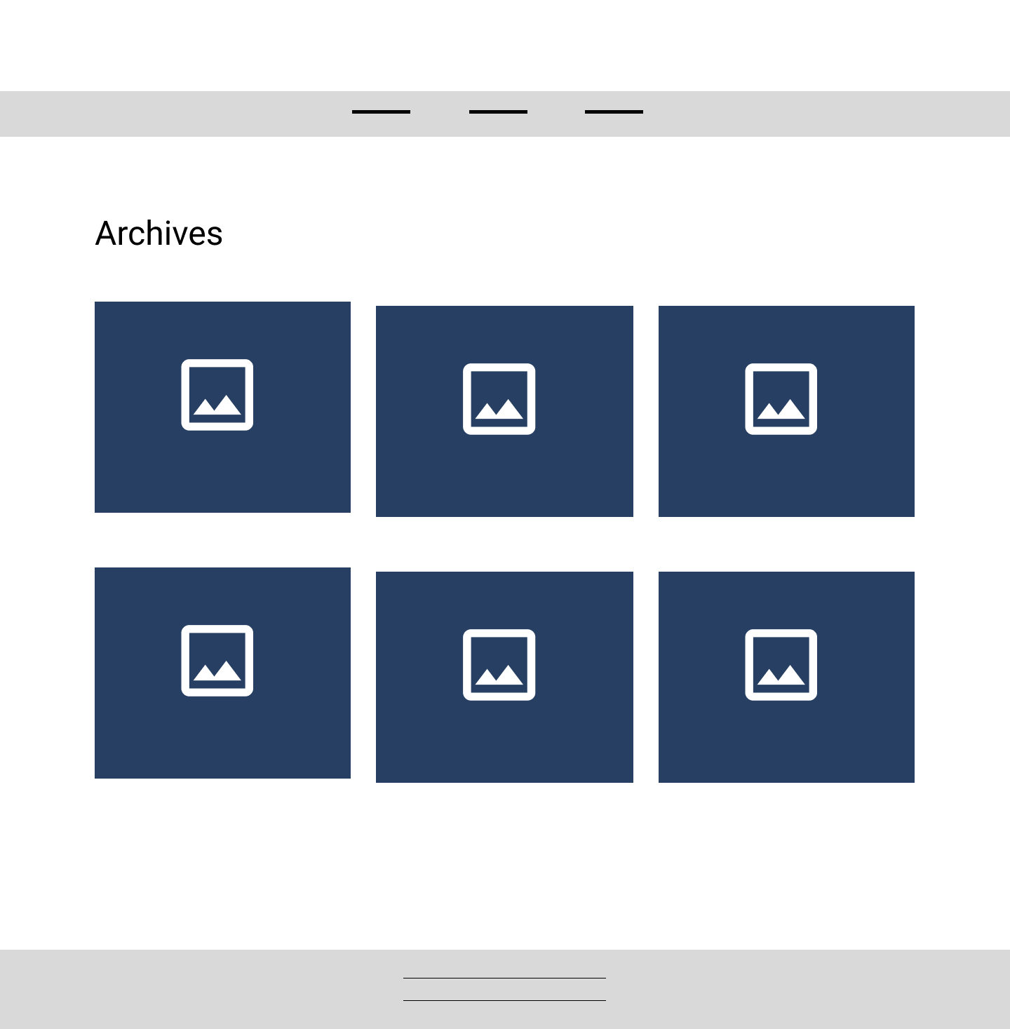
Solution: To address this, we introduced an Archives page. Here, users can explore and appreciate these captivating snapshots from the past, even if they don’t neatly align with predefined categories.
Changes Made
After meeting with the stakeholders, we opted for a standard grid pattern that includes photos. Clicking on each photo directs users to Google Photos. This approach streamlines the archived page, making it less cluttered and more user-friendly.
After collaborating with stakeholders, it was determined that having a dedicated section on the homepage to promote books available for sale to all historians was crucial. This strategic placement ensures easy access and visibility.
Low Fidelity Wireframes
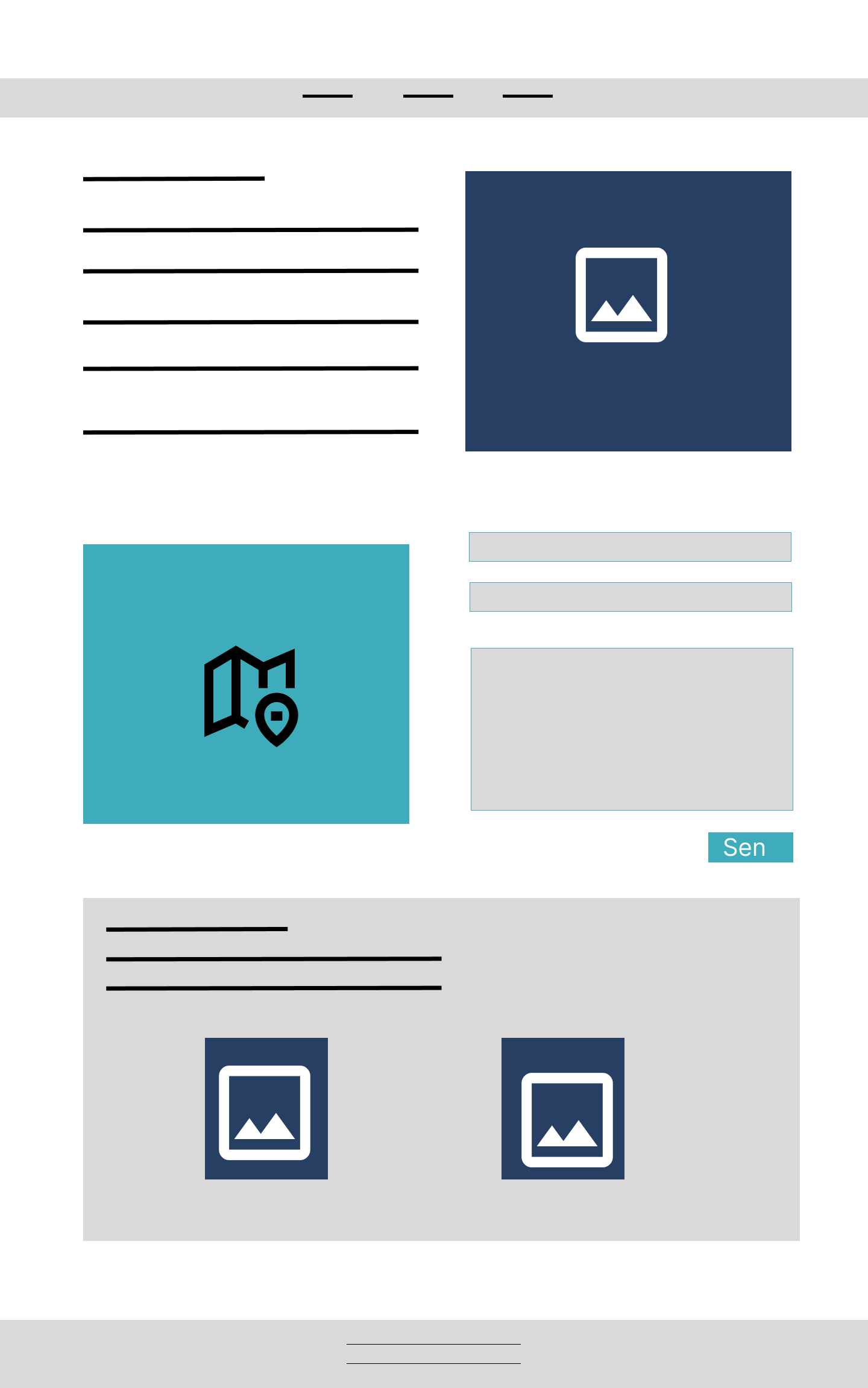
Simplifying the layout empowers users to navigate the website effortlessly. By integrating images, users can better visualize the historical landmark through the website.


Protype
This prototype seamlessly integrates images, video, and text elements to deliver to users with ease.
Challenges
Challenges: The existing domain name was tied to a third-party company called ClassConnector.
Solution: We decided that the most effective approach would be to acquire a new domain name and abandon the previous domain name.
Challenge: Our team encountered the challenge of enabling stakeholders to efficiently post events and keep their community updated. The existing process was cumbersome.
Solution: To address this, we integrated a Facebook plugin. Now, multiple stakeholders can effortlessly share events, fostering community engagement. This enhancement ensures a smoother experience for both users and administrators.
Learned:
When designing for an older audience, high contrast and larger fonts are key. I intentionally used colors with a high contrast ratio, ensuring readability. Additionally, we increased font sizes to enhance legibility. These design choices cater to older users, making their experience more comfortable and accessible..
For this audience, transparent overlays were not ideal. Instead, a simplified layout worked best.
Recollect
Future Goals
The board intends to include a roster of graduates over the years.
The goal is to enhance the archive page by incorporating yearbooks, historical documents, and other relevant materials.
Designing
When selecting colors and fonts for a design targeting the older generation, high contrast was a must-have. Having cool colors can be visually appealing yet must be balanced with sufficient contrast to ensure clarity for older users. Selecting fonts that are easy to read was crucial to enhance user experience. By choosing a font that is clear, simple, and accessible, we can guarantee that older individuals can navigate through the content effortlessly. This historical site is renowned for its exquisite windows, making it appropriate to highlight that particular feature in the logo design.
DM Serif Display (600) Semi Bold
DM Serif Display (400) Regular
Body - Roboto font size
Impact
The Windthorst Heritage website redesign was finalized in November 2023. Stakeholders expressed great satisfaction with the outcome, finding it to be a significant improvement. The platform now serves as a valuable tool for engaging with the Windthorst community and descendants whose genealogy originates in the small prairie settlement. Through this website, sharing news and events has become more efficient and accessible for all involved.


